STUDENT CLIENT PROJECT
Website Redesign
for Leading Insight
Role: Product Designer & Team Lead
Team: 13 product designers
Timeline: 4 week sprint
Responsibilities:
Coordination & Delegation of tasks • Client Communication • Information Architecture • Supporting Documentation • Team Support
Chapters:
Leadership | Research | IA | Style Guide | User Flows | Hi – Fi Frames
Project Expectation
Work in a team of 13 designers to create a contemporary redesign prototype for a consultancy agency. Leverage user interviews and heuristic evaluations to inform design decisions, strengthening brand trust and navigation efficiency within a 30-day timeframe.
Project Reality
Led a team of 12 to deliver an interactive website redesign that so impressed the client that they handed it over to the web developer the very next day—an achievement that felt highly improbable just 6 days prior. Strap in. It’s going to be a bumpy ride.
“Throughout the work, I was impressed with the capability, energy and professionalism of the team. As a client, they kept me informed along the way and provided high-quality deliverables which will be very useful for enhancing the website and better positioning our brand in the market.”
– Matthew Mulrine, Managing Director, Leading Insight
Leadership | Research | IA | Style Guide| User Flows | Hi – Fi Frames | Prototype
Leadership
Towards the end of my first student-client project, both the research and design leads had to step away from the project for a time. With no clear guidance, and a concern of falling behind, I stepped up with suggestions to move progress forward, learning the lesson of ‘where one leads, others will follow.’
After inadvertently testing the water’s last project, I was curious to see if I had the potential to lead a team in a formal capacity. With an encouraging nudge from our mentor, I tentatively volunteered to be the team lead for this project.
“This was a mistake”
Accepted by the group as team leader, I was keen to kick-start preparations for the first meeting the following day. Reality, however, had different ideas. With newcomers enthusiastic about their first client project, impromptu huddle meetings, numerous questions, and discussions about project expectations consumed most of my day. This left me with only thirty minutes to prepare my agenda.
The meeting proceeded well enough, but without sufficient time to digest and analyse the brief for myself, I lacked determination in setting tasks. I opted for an open discussion to compensate for my lack of confidence. Despite successfully locking in a couple of details for the next day, I anxiously awaited the end of the meeting, severely questioning my leadership abilities. Upon conclusion, I immediately received two more requests for 1:1’s. One from someone who had suffered technical difficulties, seeking an overview, and another from someone with criticisms about my meeting style. Mortified, you can be sure that from then on, I tried my best to ensure I prioritised my responsibilities as a team leader, even if that meant learning to say no.
Lesson Learnt: Balanced Leadership
This experience was not only humbling, but it also provided me with a sympathetic insight into the demands placed on team leaders and managers. The difference, however, is that I was a student too. It proved challenging to manage the expectations of information and wisdom some of my fellow students had for me; I had to remind them frequently that I was learning alongside them.
The project was also a lesson in setting boundaries, something I found challenging. A part of me felt I should always be available to provide a supportive ear during the stresses of a quick sprint.
Leadership | Research | IA | Style Guide| User Flows | Hi – Fi Frames
Research
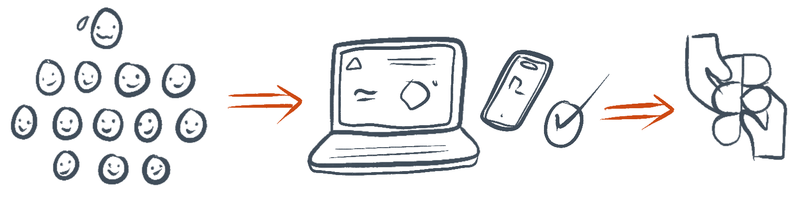
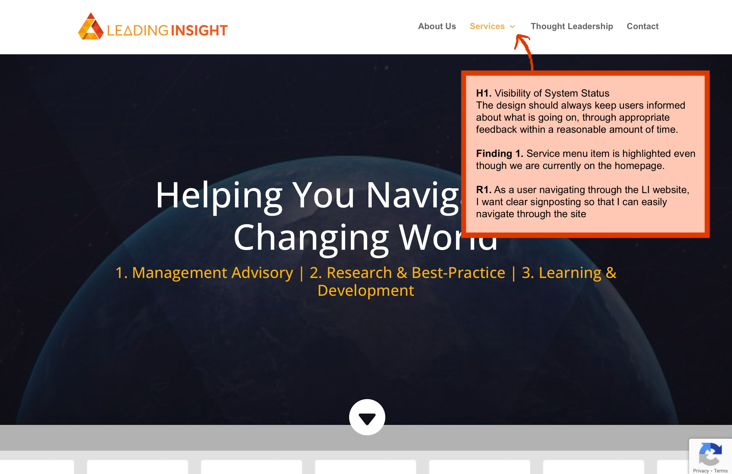
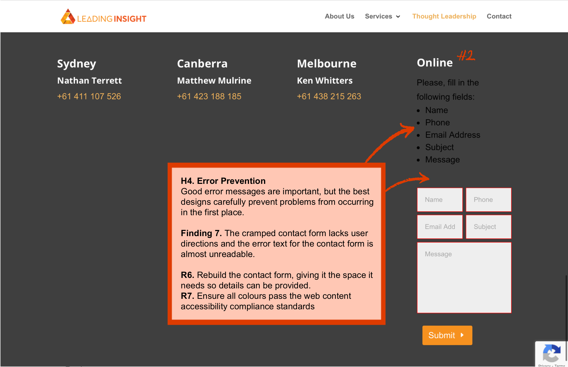
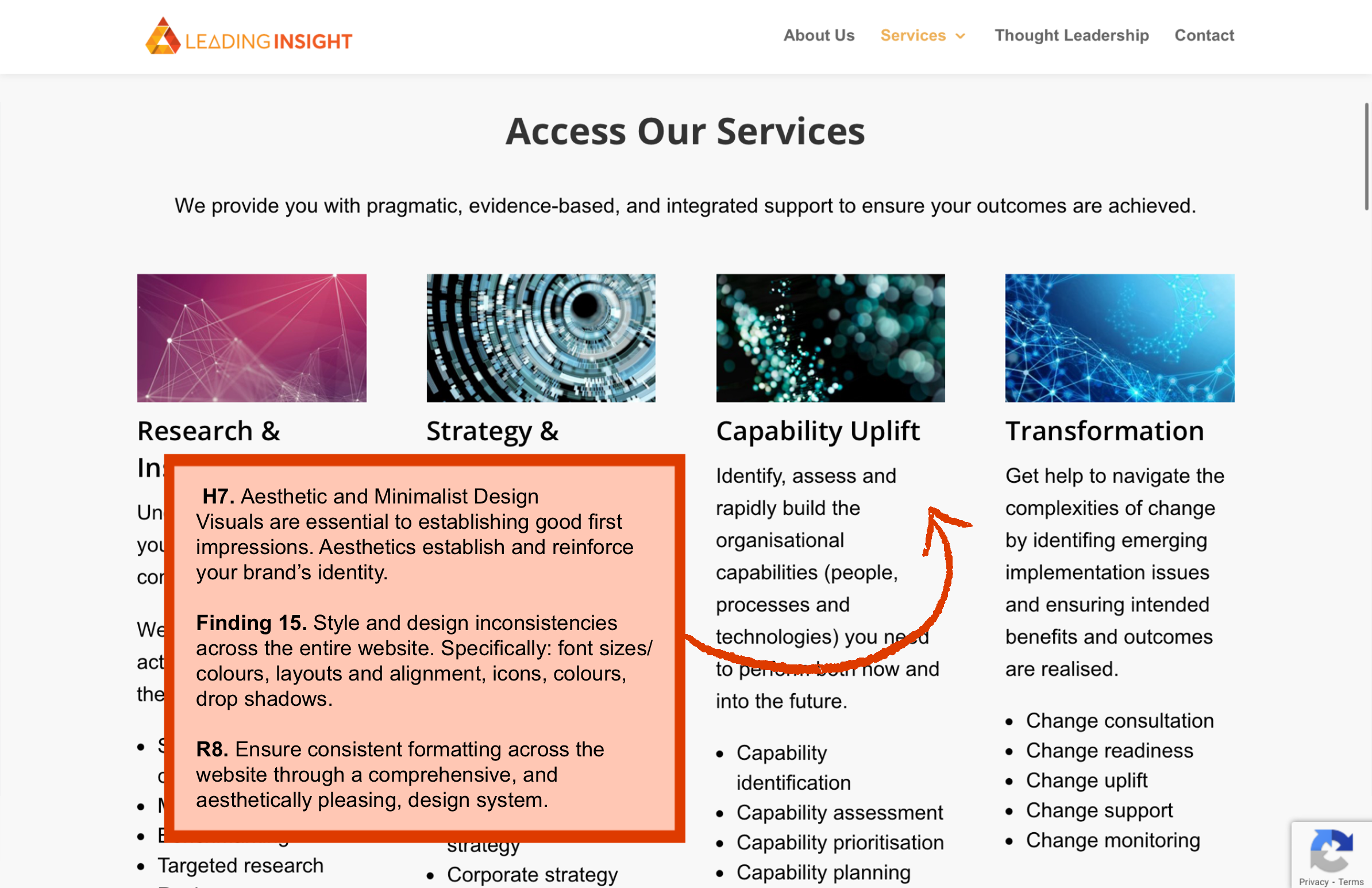
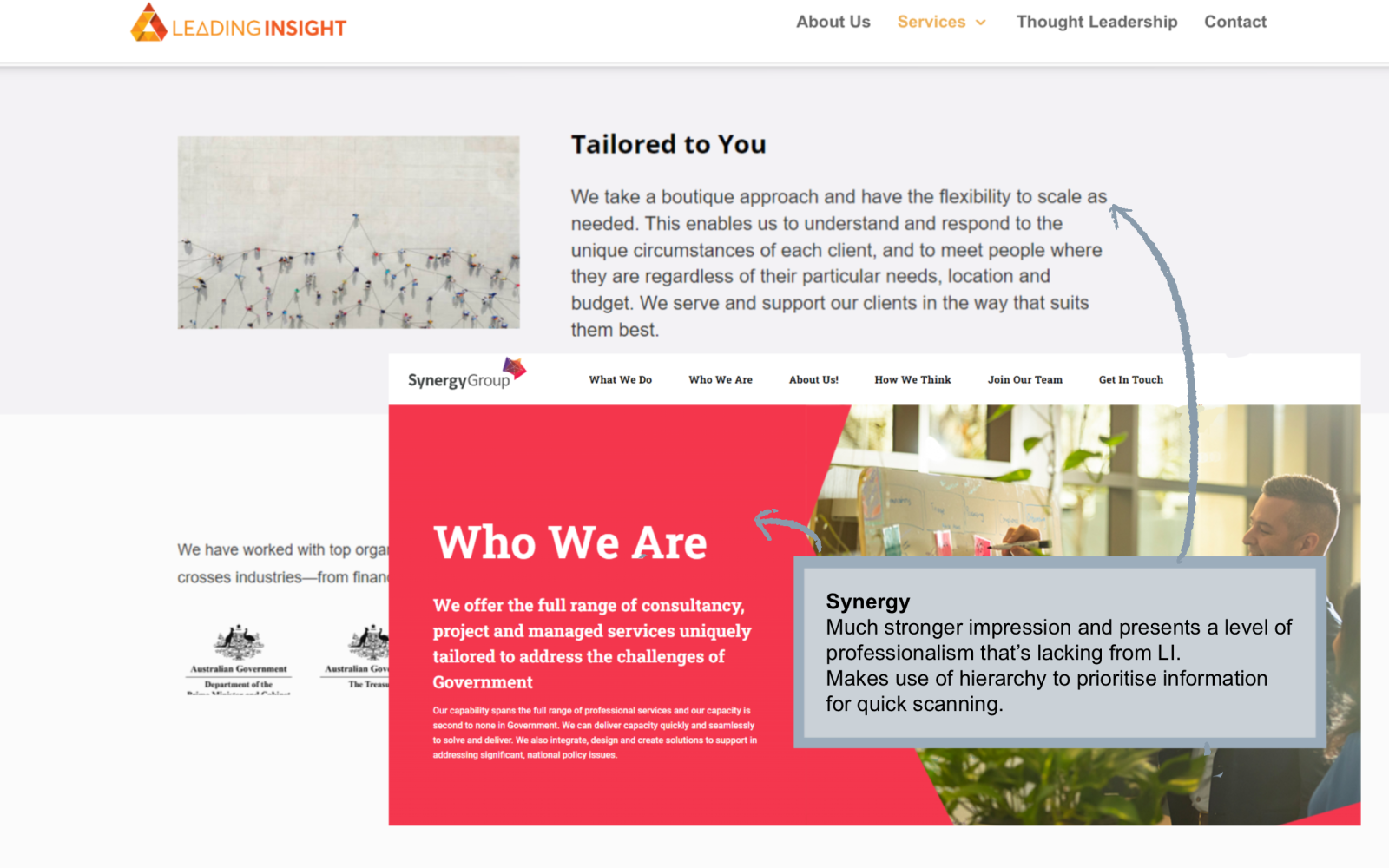
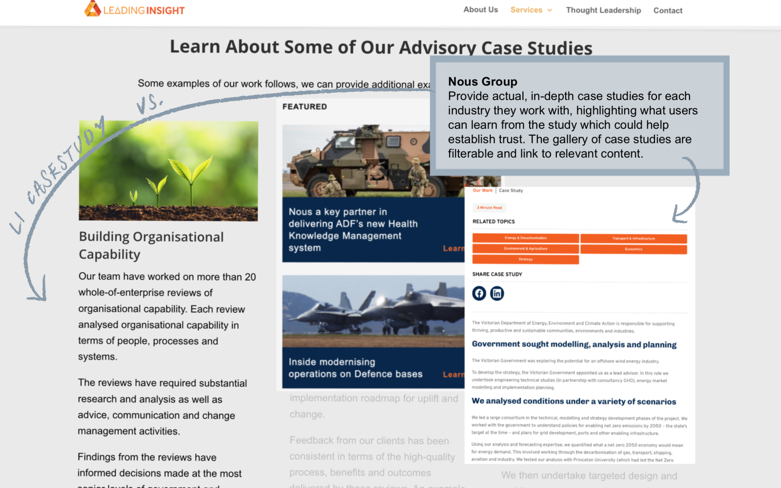
Unable to meet the client until seven days into the project, and with emails going back-and-forth about user interviews, we opted to get the ball rolling on our heuristic evaluation. Given the client’s desire to modernise the site and attract new clients, assessing the current user experience was crucial.
After identifying the heuristics, nine team members conducted their own evaluations. We paired this with a competitor analysis of three consultancies whom the client viewed as peers or aspired to emulate. This helped inform our recommendations.
“The website? I haven’t looked at it in years”
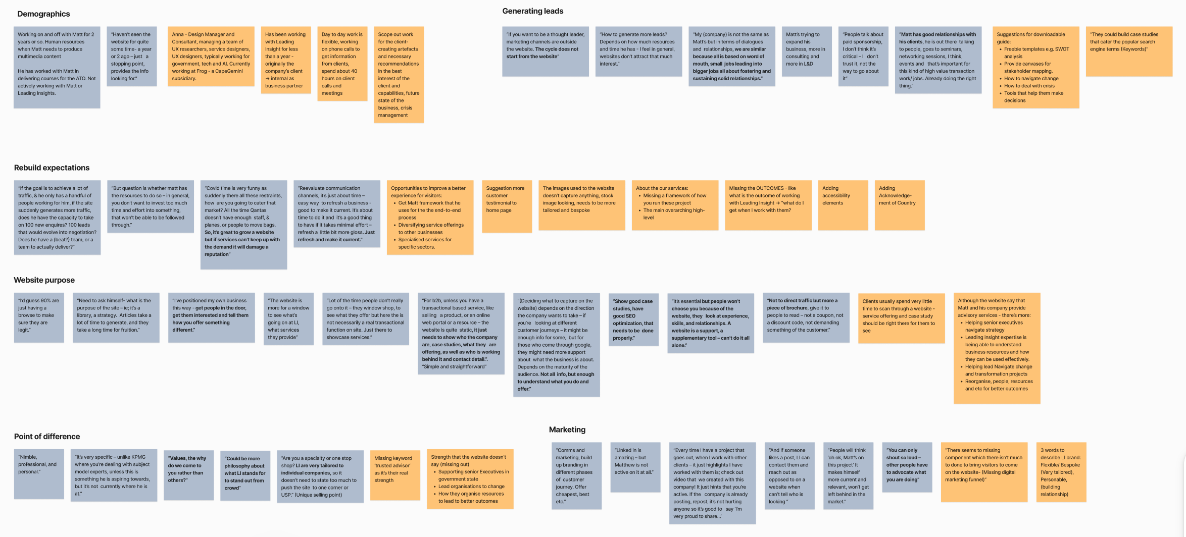
After our initial meet & greet, the client provided details for four individuals who worked closely for, or with, Leading Insight. Given the primary pain-point that we identified during our evaluation was a lack of clear, comprehensive information for first-time users (including ourselves), we saw it as a great opportunity to gauge the staff’s perspective. While the client, as the business owner, had been very cooperative in answering our questions, we were interested in the observations of individuals who could shed light on the day-to-day limitations of the website, which the client might not be aware of. Our questions focused on current lead interactions, common website tasks, and pinpointing queries that the website could be answering.
Unfortunately, the interviews proved less fruitful than we hoped. Only three individuals returned our calls, with one cancelling last minute, resulting in only two interview responses. Further diminishing our research effort, one respondent had minimal involvement in the business and hadn’t viewed the website in two years. Despite the setback, it was a valuable learning experience, one that required us to adapt our questioning on the spot. Between my fellow team member and I, we managed to obtain some relevant information.
Lesson Learnt: Team Motivation
This juncture in the project is something I would handle differently if I had a do-over. Despite discussing interviews via email, I could have pushed a little harder to secure the contact details earlier. My complacency stemmed from our previous project, where the client promptly provided access to eight individuals for immediate interviewing. Consequently, the time between making contact and locking in timeslots resulted in a slight waiting game. With competitor analysis and heuristics completed, interest and availability decreased for some of the group. I could understand the frustration of hitting a wall after building momentum, and perhaps a more experienced leader would have been more cautious of this dip. In hindsight, we should have used this time to prepare a component library to keep the team feeling engaged.
In saying that, I can give myself some understanding on this point. Within the team, there was a certain level of determination to adhere to the double diamond structure, rejecting anything that may be considered ‘jumping ahead’. As we progressed through the project, I witnessed this rigidity soften to adaptability; a valuable takeaway from the structure of these client projects.
Leadership | Research | IA | Style Guide| User Flows | Hi – Fi Frames | Prototype
Synthesis and Information Architecture (IA)
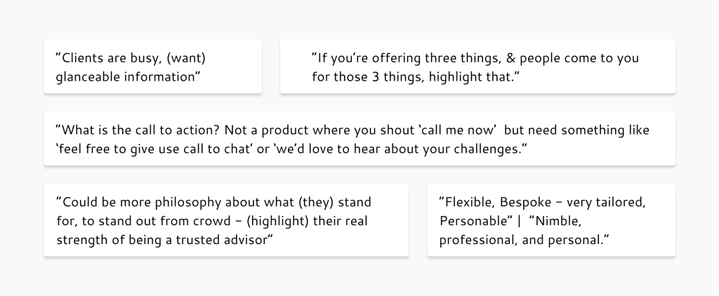
Despite our limited research, the interview responses largely supported our 15 key heuristic recommendations. This reinforced our focus on accessibility, familiar terminology, the addition of relevant call-to-actions to improve navigation, and maintaining consistency across the website.
Lacking sufficient data to justify a customer journey map or persona, we divided into two groups to address the IA and style guide – everyone eager to move to the next phase.
Reorganising the Information Architecture
I worked with the group focused on restructuring the IA, sifting through the website’s convoluted and repetitive copy to identify opportunities for enhanced information sorting. [A copy rewrite was a key recommendation for the second phase of the project.]
Original Information Architecture
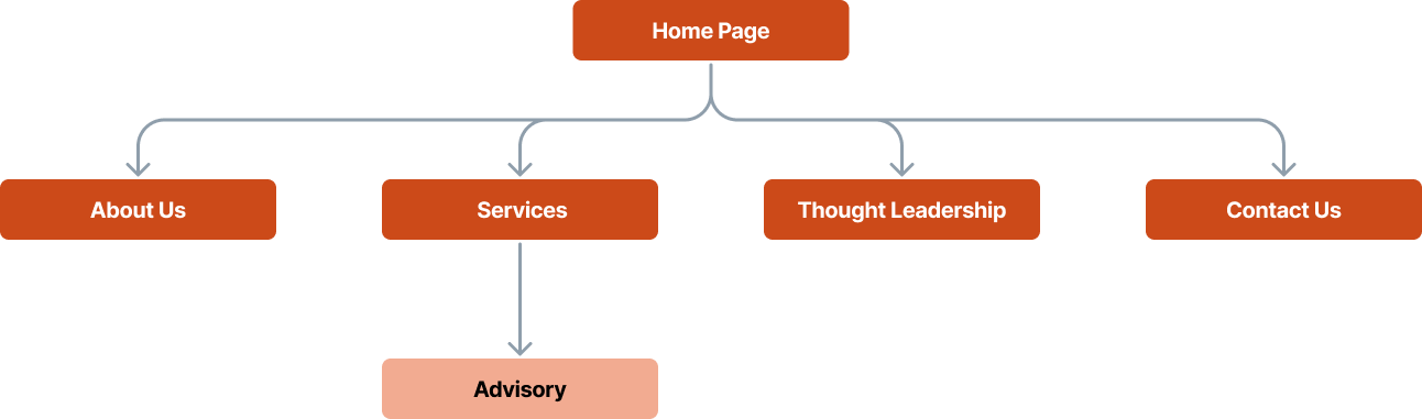
Proposed New Information Architecture

To improve clarity and discoverability, we split the three key services into separate pages, as only Advisory had its own dedicated page.
Our competitor analysis and user research both highlighted the importance of comprehensive case studies to help develop trust and interest, a far cry from the three short, generalised ‘case studies’ buried within the Advisory page. Additionally, the site featured a page titled Thought Leadership presenting several blog posts from a long past initiative. Given the growth needed in both areas, which were beyond our current scope, we opted to consolidate them under the page Our Work. This would allow for flexibility for expansion if the client were to follow our recommendations for phase 2 (expand case studies and revisit the current articles to consider if they are still relevant).
Leadership | Research | IA | Style Guide| User Flows | Hi – Fi Frames | Prototype
Style Guide (& Teamwork)
At the project’s outset, as tasks were first being delegated, I determined it would be beneficial to assign task leads. This decision was essential if my involvement was to extend beyond organising or overseeing, and it helped establish a standard of accountability. I paired this with a strong encouragement for teamwork. From my previous experience, I had discovered that the most effective and enjoyable work was achieved in small groups of 2-4 individuals, particularly during the design phase.
As the IA was reorganised, the rest of the team set about establishing a style guide, aiming to achieve a professional, modern aesthetic while ensuring the use of orange, as per the client’s preference.
“TEN ‘style guides’?! This was not the plan”
Within the group tasked with creating a style guide, I had noticed a handful of the individuals had a preference to work alone. With time running low and an increase of teamwork on the horizon, I particularly advised they split into trios to brainstorm two alternatives, hoping it would nurture some collaboration. Alas, instead of heeding my suggestion, I discovered the task lead had proposed developing individual style guides, which led to the submission of… ten homepage mock ups. But there were only six in the group, how did we end up with ten?
I had scheduled a meeting a few days afterwards to share the style guide offerings and start wireframing. As I was to be absent, I left directions. These were observed, to a degree… yet at some point during this meeting it was proposed that everyone should create a style guide of their own, due in two days’ time. (A directive I couldn’t undo because of my absence and an inconveniently timed public holiday.) This was the point in the project where I genuinely questioned our ability to get this project over the line. With less than a week remaining, instead of making progress, more time had been spent on a task than I ever anticipated.
Lesson Learnt: In Fear of Time, Don’t Skip Steps
We had reached the point in any project where the solution still feels foggy, but you’re hyper aware of time slipping away. I was feeling an internal pressure to put each foot right, and had, without complete certainty, decided a wireframe ideation session would best keep momentum. When I discovered how the exercise had been skimmed over in favour of designing mock homepages; I realised that, in pushing forward, I had neglected to ensure we had a firm grip on our user stories and user flows to support the wireframing. Though this task was recognised by the group as a jump too far, the correct course of action unfortunately wasn’t identified.
Feeling disheartened, not to mention rather stressed, I arranged a meeting with our mentor to ask for guidance. He wouldn’t be available until the following day, so I sat back down at the drawing board and pieced together a redemption plan for the last six days. We had a working high-fi prototype to deliver! I needed to be confident in my leadership and directions if we were going to steer this thing in the right direction. Getting our mentor’s thoughts on my plan gave me the boost of confidence I needed to believe we could pull this together.
Leadership | Research | IA | Style Guide| User Flows | Hi – Fi Frames | Prototype
User Stories and User Flows
Ten homepage offerings? No problem! We voted, surprisingly quickly, and locked in a design style. I assigned two individuals to lead the hi-fidelity build, starting with the creation of components.
From our 15 heuristic recommendations, we identified 15 key user stories. The user stories that related to navigation evolved into the creation of 6 key user flows; helping us prioritise which pages to build first. With time running short, we needed to ensure we delivered the most important pages!
“Go with the flow & you’ll get where you need to be”

Below is an example of our how we developed our user flows.

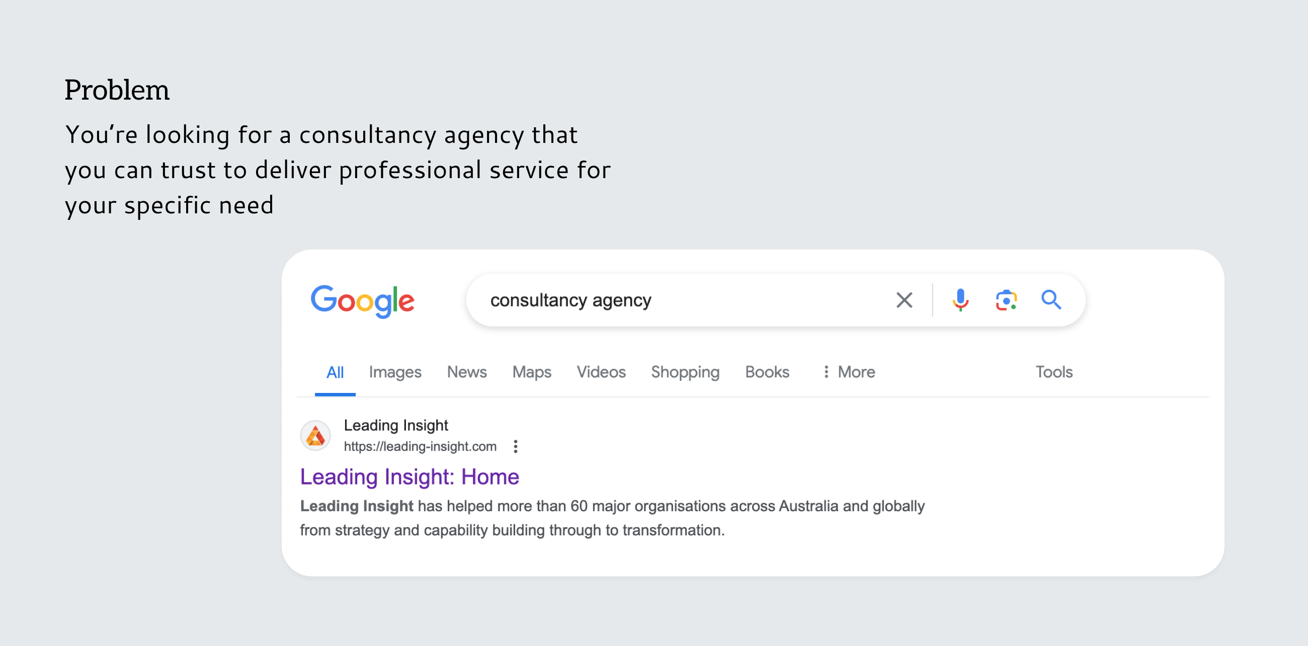
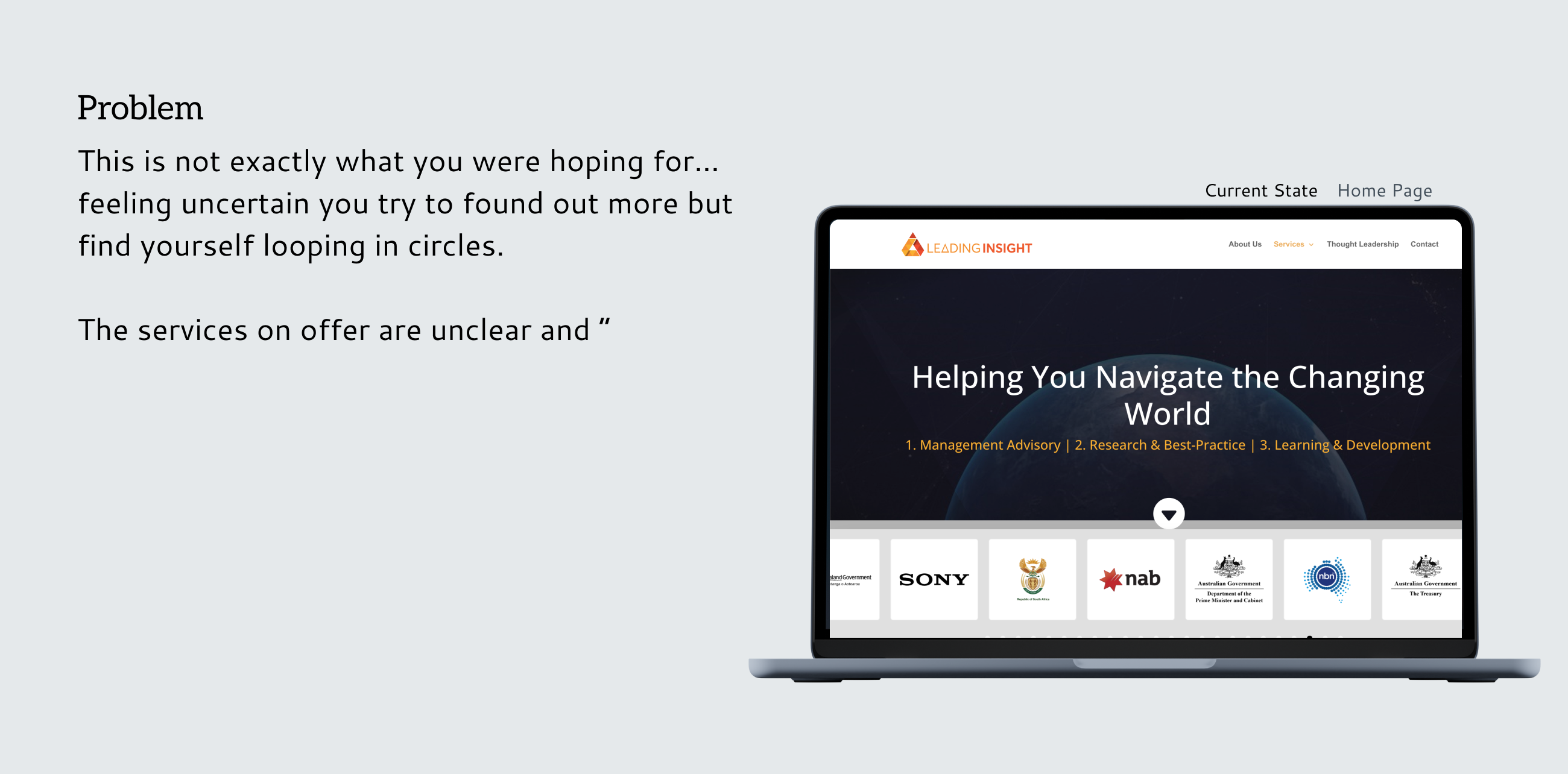
Heuristic Finding: The home screen and services page are the same page.
Why is this an issue? Both pages are necessary, however serve different purposes; information and navigation is blurred and the user can become confused. It also misses an opportunity for your home (landing) page to ‘capture’ the user.
Heuristic 3: User Control and Freedom | Heuristic 4: Consistency and Standards
Recommendation 2 (R2): Create a separate home page and services page.
User Story: ‘As a potential client visiting the Leading Insight website for the first time, I want to easily find information about the different types of services that they offer so that I can quickly determine if they have expertise’s in management advisory ‘
Userflow 1: Home > Nav Bar > Services > Management Advisory > Call team
Userflow 2: Home > Scroll to Services CTA > Services > Management Advisory > Scroll to Team CTA > OUR TEAM > Contact CTA > Contact Us > Submit form (or call)
Userflow 3: Home > Scroll to Services CTA > Services > Management Advisory > Scroll to Contact CTA > Contact Us > Submit form (or call)
Leadership | Research | IA | Style Guide| User Flows | Hi – Fi Frames | Prototype
High Fidelity Prototype
Working in small groups, each page was developed and reviewed for consistency and checked against our heuristic checklist before proceeding to the next one. Over the following days and nights, we prepared several pages for prototyping.
Although the client did not explicitly request mobile views, we believed it was crucial to demonstrate how the website would scale down. Given that the homepage and the Management Advisory pages were the most complex, we created mid-fidelity prototypes for these two pages.
“This is What I’m Talking About!”
As a designer, it’s sometimes challenging to put aside the desire to prove your skills and express your own opinions. However, as the lead of 12 designers, you can be certain there were already plenty of opinions in the mix, (as we found out in the style guide exercise). Moreover, there was a presentation to assemble and handover artefacts to complete.
Considering these factors, I felt it would be beneficial to act as a stakeholder for the building of the prototype; checking over each page with fresh eyes so I could question the decisions being made without being swayed by my own biases. This approach ensured someone was overseeing the process to confirm that design decisions were supported by reasoning—not just ‘because it looks cool.’ It also ensured a sense of cohesion in the flurry of a three day build.
To illustrate the rationales behind some of our design decisions, let’s touch on user flow 1: A user wishes to check out Leading Insights services before deciding to make contact.
Comparison 1
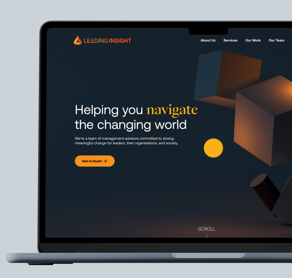
First, we’ve elevated the landing page to create a stronger impact. The new hero image depicts the innovative ‘insights’ Leading Insight (LI) delivers with its out-of-the-box thinking.
Unlike the original site which offered its first call-to-action midway down the home page, our redesign allows users to navigate the site in multiple ways right from the start.
Previously, the site introduced a carousel of other companies immediately after the greeting, with no title to indicate their relevance. In our redesign, we prioritised establishing LI as a business in its own right before showcasing its clients.
Comparison 2
For some unusual reason, in the original site, the Services menu item links right back to the homepage, unless you access Management Advisory through the dropdown list (R1). Considering this was one of the three key services LI offered, we brought the trio further up the homepage, and ensured they could act as through-links to dedicated pages. Due to limited copy regarding the other two services, we could only build a Management Advisory page.
It was evident that interactive websites were popular among LI’s competitors and aligned with the client’s desire for modernity. However, I was conscious about implementing interactions effectively. Some that were trialed were impressive but compromised accessibility.
Comparison 3
Following on from the previous, this was the layout we would replicate for the additional two service pages. To avoid overwhelming users with too much information, we felt it was important to break up the details and give them the space they deserved. These pages would link to relevant case studies so users could delve deeper into LI’s capabilities.
Comparison 4
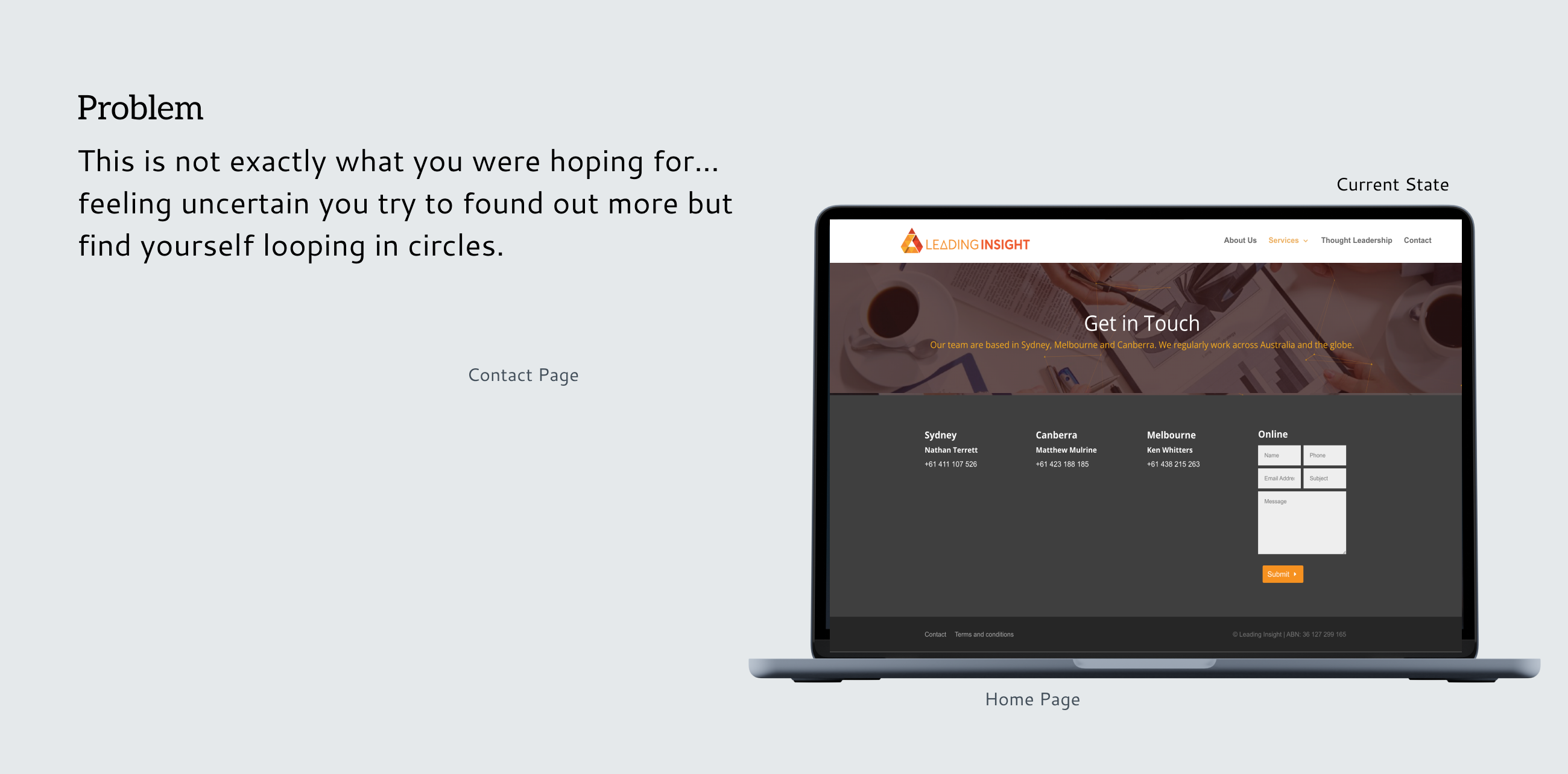
As cited in R7, the contact form had previously been relegated to the footer. We moved it out and gave it its own page to make it feel more inviting and less obscure. This new page includes photographs of the team members who can be contacted by phone to put a face to the name – (see prototype below).
Lesson Learnt: Good Leadership Lets the Team Shine
Since I wasn’t as involved in the design stage in the way that I was used to, it offered a different perspective, one that I valued in its own way. Those last five days were incredibly rewarding. My biggest concern was that the pages would look disjointed, but the team worked together like a well-oiled machine. To an outsider, they would never have suspected the challenges we faced just a handful of days before. I enjoyed the buzz immensely and was thrilled to see everyone taking initiative and striving to deliver something that would truly impress the client. I feel this was the point where I found my confidence in my leadership, particularly in utilising my enthusiasm and good humour to uphold morale. Most importantly, we even had some fun.
Leadership | Research | IA | Style Guide| User Flows | Hi – Fi Frames | Prototype
Next Steps
Considering the short sprint and the limitations of a student/client project, there were inevitably a few things we recommended for the next phase.
User Testing: Due to time restrictions and limited access to users, we couldn’t undertake this crucial step.
In addition to:
– Review of the Written Copy
– Personalisation of Stock Photos
– Expanding Case Studies
– Developing LinkedIn Presence
“Ready for Phase 2?”
There’s a moment when the presentation wraps up and you’re holding your breath, waiting for a response. I’ll be honest, I feared for a moment that we’d missed the mark… but nope! The client was incredibly pleased, and confirmed he would be handing it over to the web developer immediately. He was thrilled with the interactions, the clear break-up of information, and the pairing of navy with orange— deftly paired with rounded corners to soften the corporate feel. The client even offered the team an opportunity to continue with the project for phase 2.
“Given the quality of the work, I have asked the team to further support our brand positioning and website enhancement work. I would definitely recommend the team to anyone looking to undertake evidence-based improvements to communication, UX, UI, or website products.“
– Matthew Mulrine, Managing Director, Leading Insight
I’ll be honest, the buzz after this glowing feedback was enough to almost make me misty eyed. It had been a genuine rollercoaster. I hadn’t anticipated the extent to which I would need to manage team dynamics, including balancing personalities and different learning styles. Yet, for that very reason, I felt I gained a tremendous amount from this project, though between you and me, I think I’ll leave team leadership for the future when I have more hands-on experience.
Made it this far?
Thank you!
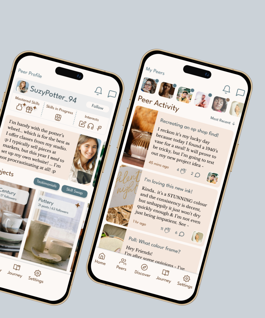
Are you a fellow creative looking for friends, or perhaps you’re interested in swapping skills?
Or wish to relive the fun?
Leadership | Research | IA | Style Guide | User Flows | Hi – Fi Frames